At IIIT-Delhi most students found it difficult to interpret and memorize a wide range of courses all with different times, venues for lectures and days of the week.
On the flip side, multiple bookings of a classroom for student activities during a time slot also makes it hard to coordinate and organize meetings for the different clubs at the institute. These inconveniences inspired our concept mobile application – Go! Classroom.
Designer, Prototyper, and Engineer
Prateek Mehra, Shruti Nagpal and Utkarsh Gupta
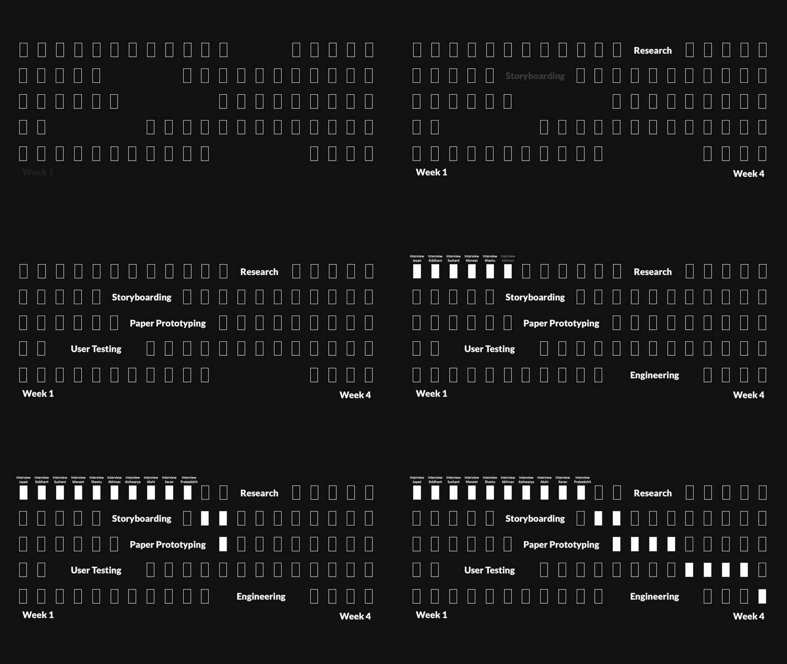
4 Weeks (2014)
How might we improve classroom management for students and administration at IIIT-Delhi?

We conducted 10 user interviews to understand if the problems we identified resonated with other students and the administrative staff at IIIT-Delhi. We had our interviewees walk us through their ways of locating lectures and booking spaces for club meetings and events. We also tried to probe them and understand their expectation from an application like ours.
From our user interactions, some of the interesting take backs included how people tried to remember which classroom they had to go to – some wrote it down on their books, some memorized the timetable, some looked it up on the bulletin boards and whatnot. Most people weren’t aware of the current classroom booking system and were taken aback when told that such a procedure exists.
In addition to features we proposed, our users also wanted to have the option of looking at an entire week’s calendar view and the possibility of organizing study groups through the booking feature of the app.
I built interactive storyboards to help us and the users better understand when Go! Classroom would be useful and how it would fit into to user's experience.
Try hovering over the scene to listen in.
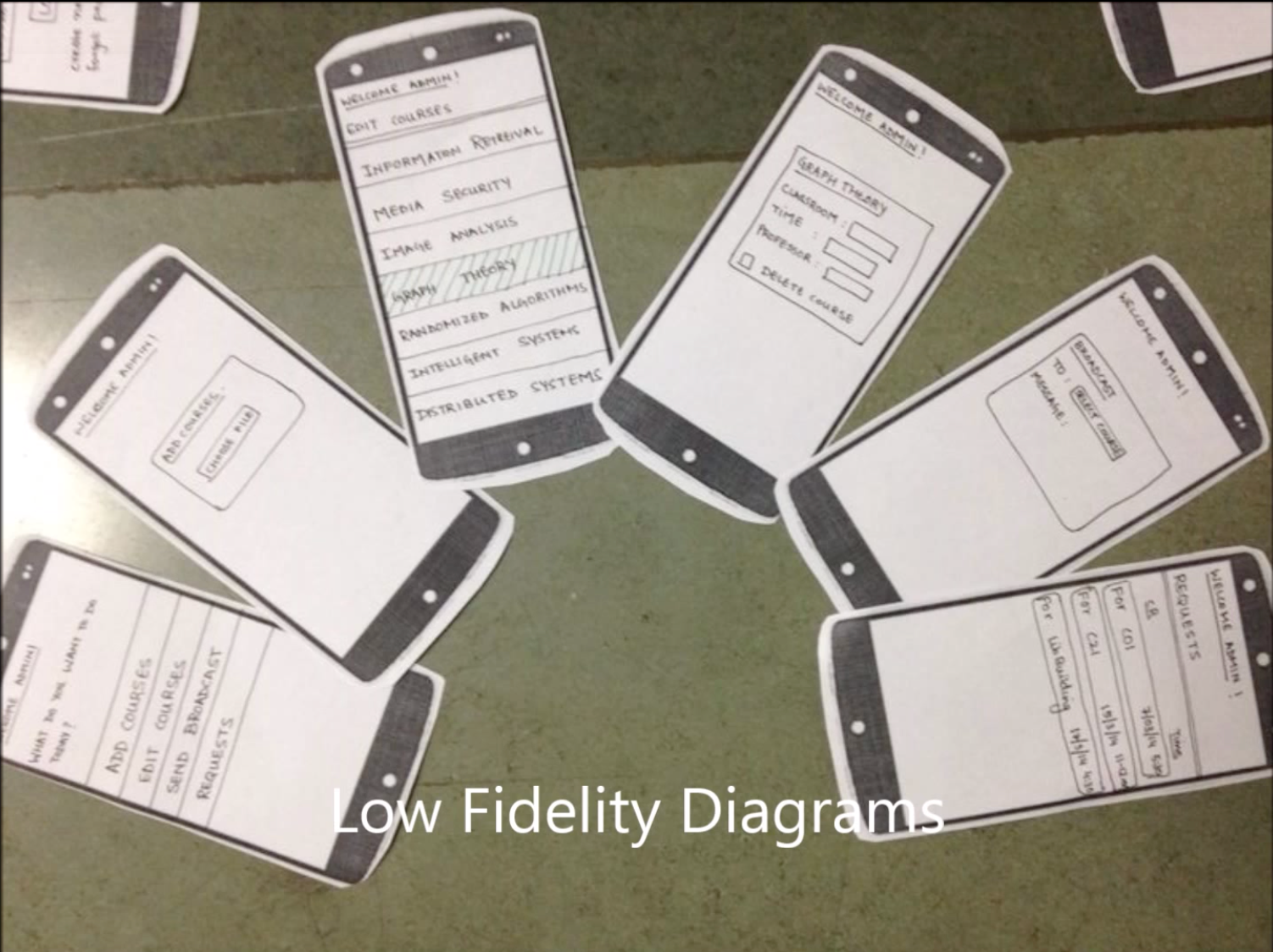
For this project, we decided to go for paper prototypes which we used to run a concept validation study by conducting guerrilla usability testing. By giving our users a walkthrough of the various screens of our application, we understood how they would use the application.

This helped us with our user flow analysis and narrowing it down - getting rid of extra screens and adding relevant ones.
We spent a lot of time paper prototyping and understanding how the application and its experience was perceived by potential users.
Later, I hacked on the application overnight. The result was a simple, clean and easy to navigate application which rightly served the purpose it was intended for. The application was showcased on Building Better Interfaces 2014 (BBI) @ IIIT-Delhi.
This app was built as a course project for a DHCS (Designing Human Centered Systems) course in my undergrad. I hacked on it a few hours before the submission. If I had more time, I would spend time refining and testing the visual design with real users before coding it directly. I would definitely reskin it given the opportunity, since it was built in 2014 when I had no context to UX methods and it was my very first time in that arena.
That's all folks! Thank you for reading.
PM


