Clothing The Recycling Gap
In the state of Washington, specifically in King County, 95% of clothing disposed of as trash could instead be recycled. From the beginning of this project, there were clear signs of a lack of awareness amongst the residents of King County about clothing recycling.
The local government was ineffective in communicating what clothes could be recycled and where the residents could do it. This motivated us to explore ways of streamlining the slipshod process of clothing recycling.
This app is a one-stop solution to the Clothing Recycling quandary. It features curated educational content and helps people locate recycle dropboxes or schedule pickups from the convenience of their homes.
It inspires recycling habitually by rewarding people who frequently recycle.
Get introduced to the top features of the app:
Discover
Dropoff or Pickup
Progress & Rewards
To make this experience more engaging and fun, I created illustrations (using humaaans library) that represent each of the said features.
Educate yourself about clothing recycling and why you should do it. Understand what can and cannot be recycled by looking at photos of acceptable items or going through a categorized list of clothes, shoes, accessories, bedding, linen and toys.
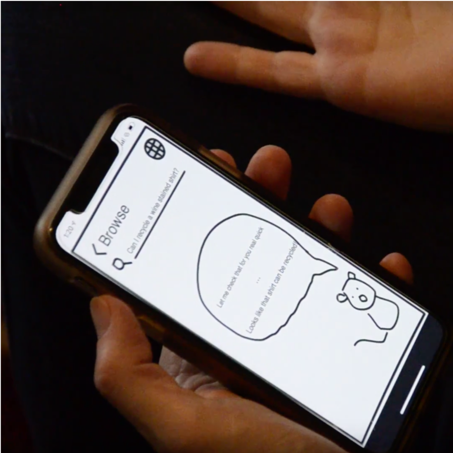
Doubtful whether that wine-stained shirt can be recycled? Get details on when to recycle or donate depending on article type, fabric, or wear. Learn about how materials age and how to properly discard them.
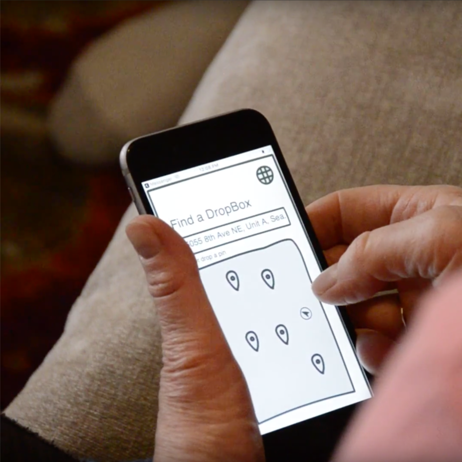
Have your purge pile ready to be dropped off? Pick a partner and get directions to your closest dropoff location in King County.
Planning to drop it off while running other errands? Schedule a location-based reminder in the app and check it off your to-do list cause we have got you covered.
Can't find a dropbox nearby? Schedule a pickup from your home instead. To coordinate a smooth handoff, get notified with a tracking link and crew details, closer to the scheduled pickup time.
Track your past recycling activity and find your latest notifications/updates in your profile feed. Collect and redeem rewards and upgrade your status to unlock benefits with our partners when you recycle frequently. Claim your tax deduction right in the app itself.
We used various research methods to understand what keeps people from recycling clothing. The survey told us about people's understanding of the recycling process. Observing and interviewing people donate/buy clothes at Goodwill in Dearborn informed us about their habits. Role-playing methods helped us discover loopholes in the existing process. Deep and extreme interviewing allowed us to focus on user needs. This research not only confirmed our assumptions about awareness and convenience of clothing recycling but also brought out a few more issues to light.
We got 159 survey responses. An analysis of these responses revealed that in the last year itself, 93% of households donated unwanted clothing, while only 20% recycled.
Most households were donating clothes but were seldom recycling. Many participants of our study didn't know what clothes are recyclable, nor were they aware of a nearby recycling dropbox. The biggest obstacle reported was the convenience of the recycling process.
Most people were embarrassed to hand over their tattered intimate clothing to someone else and instead preferred to trash it. The existing process was not friendly for non-native English speaking communities and needed to be more inclusive.
From our research, three distinct personas emerged based on their past habits of discarding unwanted clothes. Our primary audience were those who had never recycled.
Ideating concepts for these users would lead to solutions that also work for those who already recycle clothes and are only looking for more convenient ways of doing it.
We brainstormed and ideated for 6 hours straight. We asked a myriad of "how might we" questions and encouraged each other to come up with our wildest ideas without thinking about constraints. We then evaluated each of these ideas against our design goals and selected our top three.
We decided to move forward with the mobile app since it was befitting all our design requirements and our carefully chosen design goals. It was also the best medium to reach a wider audience and provide more educational content.
We wanted to create a concept prototype that could invite critique and open up a dialogue with our users. So, I designed a quick and dirty prototype in InVision FreeHand that allowed us to test alternatives and even scrap entire user flows early on in the design phase.
Given how little people knew about clothing recycling, we hypothesized that they would want to be hand-held through the recycling process. We designed a guided experience with the possibility for users to jump ahead, depending on their previous recycling experience and knowledge.
The experience included a phase where people had to select what clothing they wanted to recycle by adding it to a Recycle Cart.
On testing this concept with seven users, we realized people wanted guidance but also looked for flexibility in the experience.
They desired the freedom to start wherever they felt comfortable and skip entire phases (like adding to a recycle cart.) Most users wanted to "get done with it ASAP." Many couldn't make sense of our "tour" terminologies. Some felt uncomfortable about receiving points at each stage. A lot of changes were coming.
We stripped back the gamification and hand-holding built into the experience, completely doing away with the recycle cart experience. A new onboarding experience introduced people to the capabilities of the app and then let them configure their recycling journey. Following their first act of recycling clothes, people wanted to know what ensued. It was an opportunity to build better user engagement and promote recycling habitually.
We closed the loop by showing each user's landfill statistics and neighborhood ranking in their profile tab. Better rankings and statistics earned users rewards with our partners and presented the motivation for them to keep coming back. In our bid to be inclusive, we translated the app's content into Spanish and Mandarin
[commonly spoken languages within King County].
With this, the design was wrapped in higher fidelity, adding supporting visuals and interactions.
Due to time constraints, we had left the app in medium fidelity without completely fleshing out the main user flows. In October 2019, I decided to redesign the app.
I composed elaborate flows, visuals, and micro-interactions which breathed life into our designs. I looked through our research and ideated solutions for specific problems.
We got in touch with clothing recycling advocates in King County through an email discussing our insights and solutions. We met with officials from King County and the City of Seattle to discuss our ideas and how they could have an impact in the real world.
Our work was celebrated in the "Design in the Wild" contest by Facebook as it received one of the top three spots.
It was further publicized by Facebook in the IxDA Interaction 2019 Conference, in Seattle.
In a small yet significant way, we created a ripple in the recycling space by educating a lot of people about clothing recycling and shining a light on the topic, in that regard.
of 500 pts
How to engage people in a process like clothing recycling?
How to motivate them to come back and do it again and... one more time?
In a world full of apps that hog users' attention using dark patterns, building engagement was treading tricky waters. It required a lot of fine-tuning and a shift in perspective. A straightforward approach at gamification did not hold water and instantly collapsed. Users saw through it and felt uncomfortable about it — "Why am I getting points to recycle? What do I do with them?" Our design was missing a clear purpose. To motivate people to keep coming back, applauding them for being environment-friendly was not enough.
We stopped giving away points and started showing how much waste they had diverted from the landfill. This change in strategy was well-received as it gave users something to take away and wear as a badge of honor. In the final iteration, I brought back points, this time with a clear purpose — to act as cheerleaders and progress indicators for users to earn rewards and status upgrades. Points catalyze people to keep recycling until they have done enough to be rewarded.
—
"Purpose begets user engagement."
