Cascade Bicycle Club is the nation’s largest state-wide bicycle non-profit. It serves bike riders of all ages and abilities throughout the state of Washington. Currently, Cascade's website is heavy on content lacking a clear hierarchy and consistency. I identified some of the club's goals & missions and designed a visual style guide which could help them communicate their message more effectively and bring more members & volunteers onboard.
Visual Designer
This was a solo project where I redesigned the client's website and also showed how this visual system could be applied to other platforms and media.
9 Weeks (January 2019 - March 2019)
A simple scan of cascade's website revealed the following areas of focus when it came to their mission.
Transform the state through bicycling
Create exceptional opportunities to ride
Be bold and bring people together through bicycling
Teach everyone to ride safely
Share the joy of bicycling
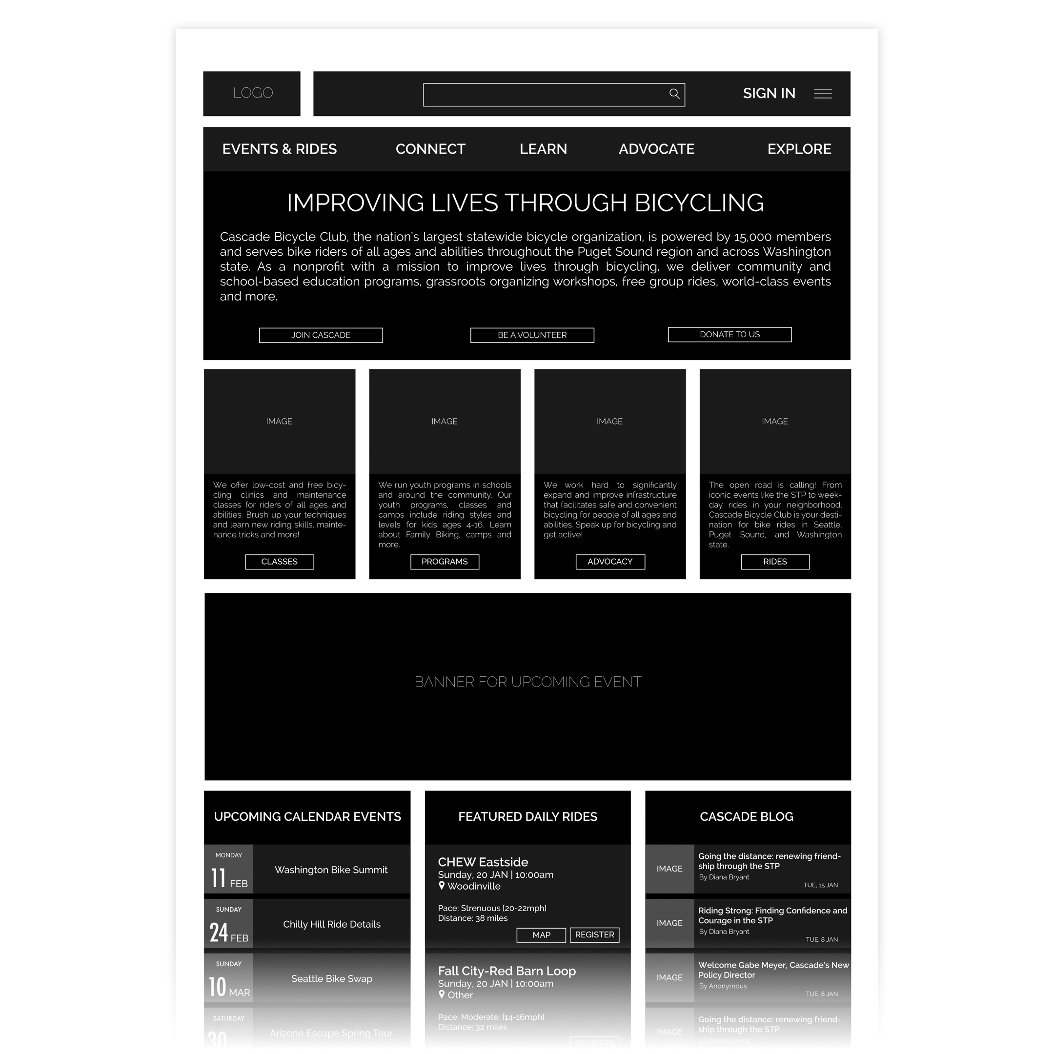
The existing visual system lacks coherence and consistency. The use of bright complementary colors makes it harder to navigate a content heavy website. The information architecture lacks hierarchy with no clear way of consuming information systematically.
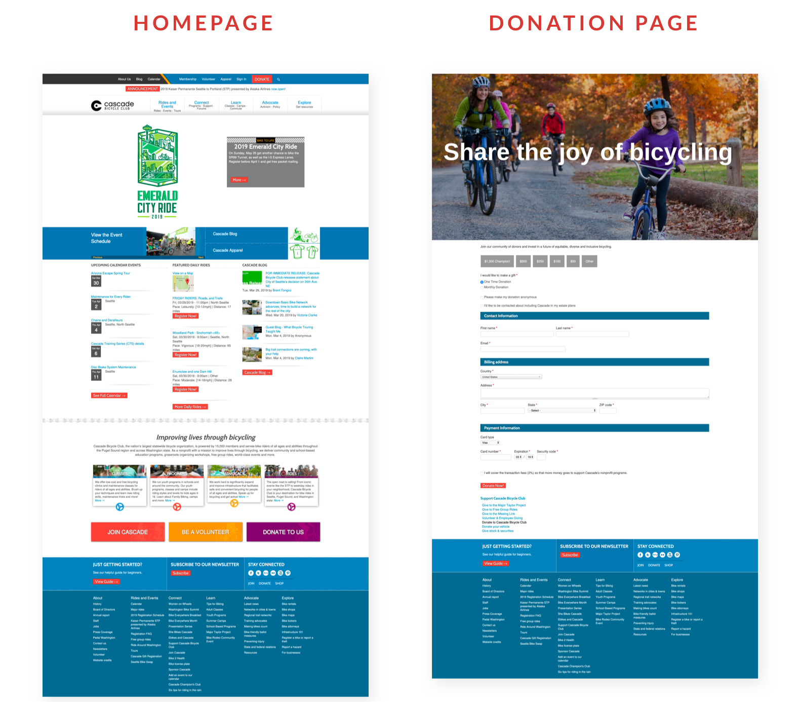
The footer features all the possible links that exist on the website and clearly does not solve any purpose. The visual language doesn't speak to the mission of the organization — to inspire and transform society by bringing everyone together through bicycling.
The navigation between different pages is also inconsistent. For instance, the donation page is missing the top navigation bar which makes it impossible to navigate out of that page without using the browser back button.
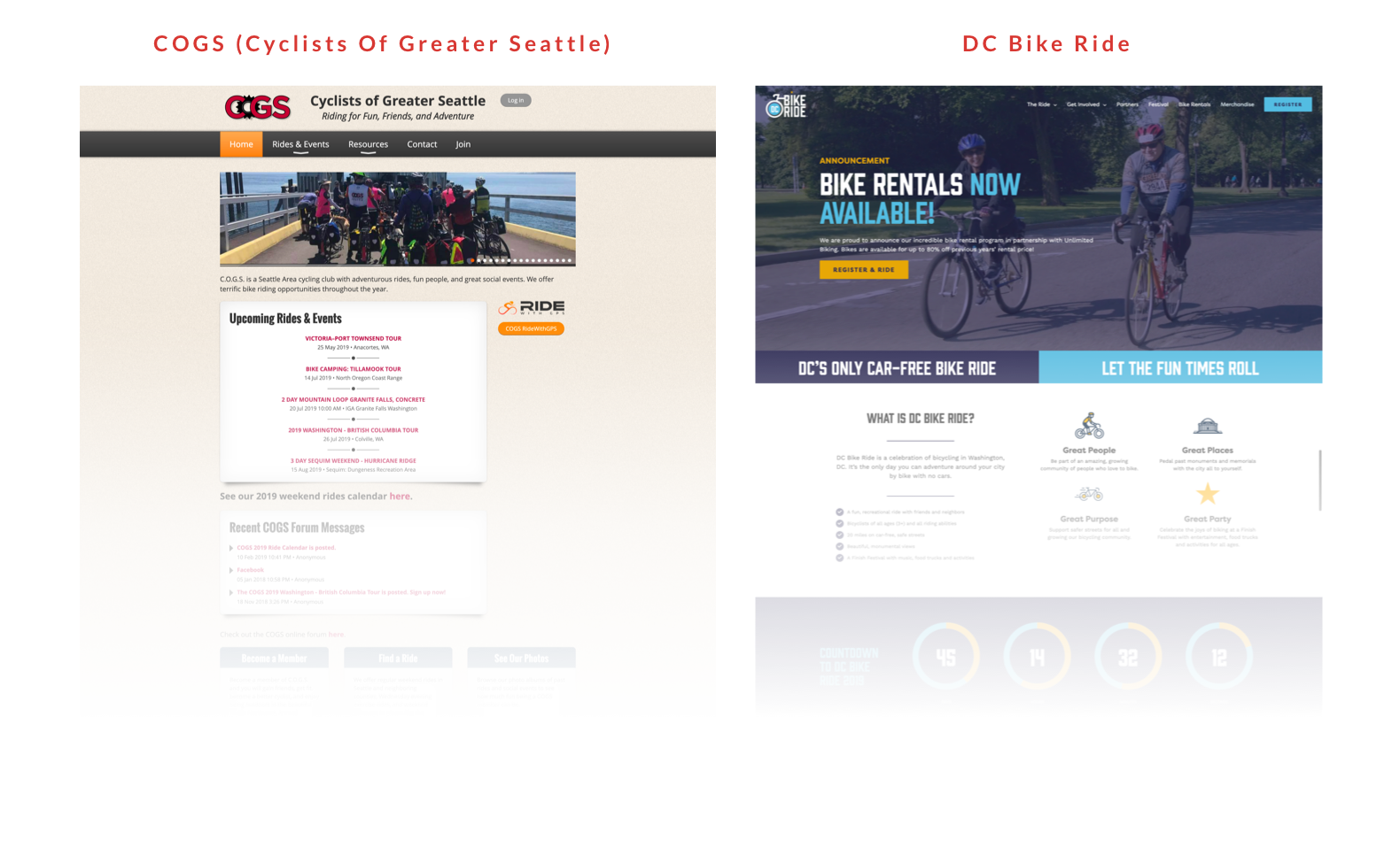
Looking at other bicycling clubs’ websites, the bolder use of imagery, systematic navigation and clubbing of similar information makes these websites easier to navigate.
- The visual language does not match the goals and vision of the organization.
- The website lacks proper information architecture and content hierarchy.
- The visual system is not consistent.
I improved the site’s structure by chunking similar information together and organizing the content on the homepage by importance. I added white space and let the images bleed to the margins to make the experience more immersive. I also introduced an accent ribbon which resembles a milestone to hold all the important information on the page to help users navigate with ease.
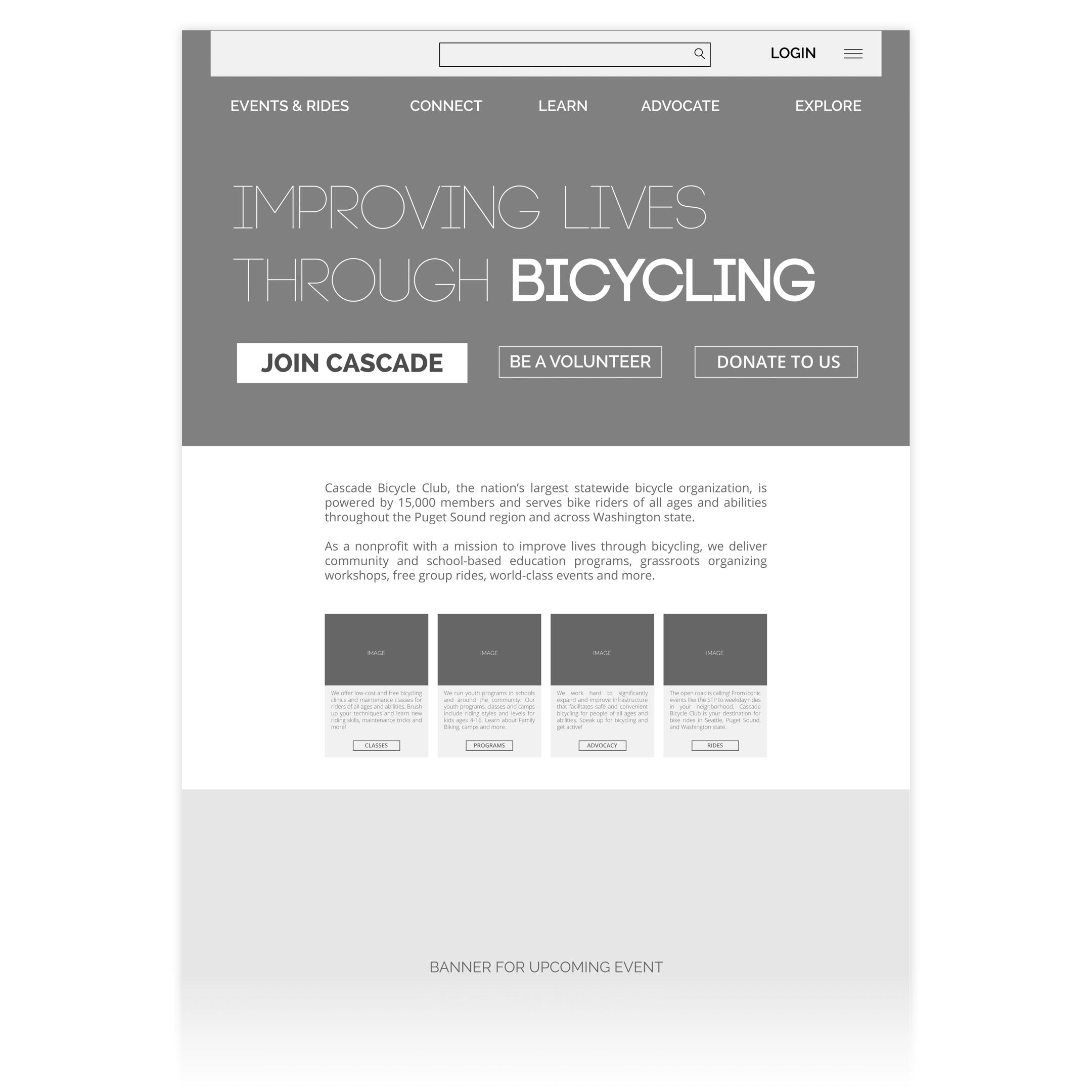
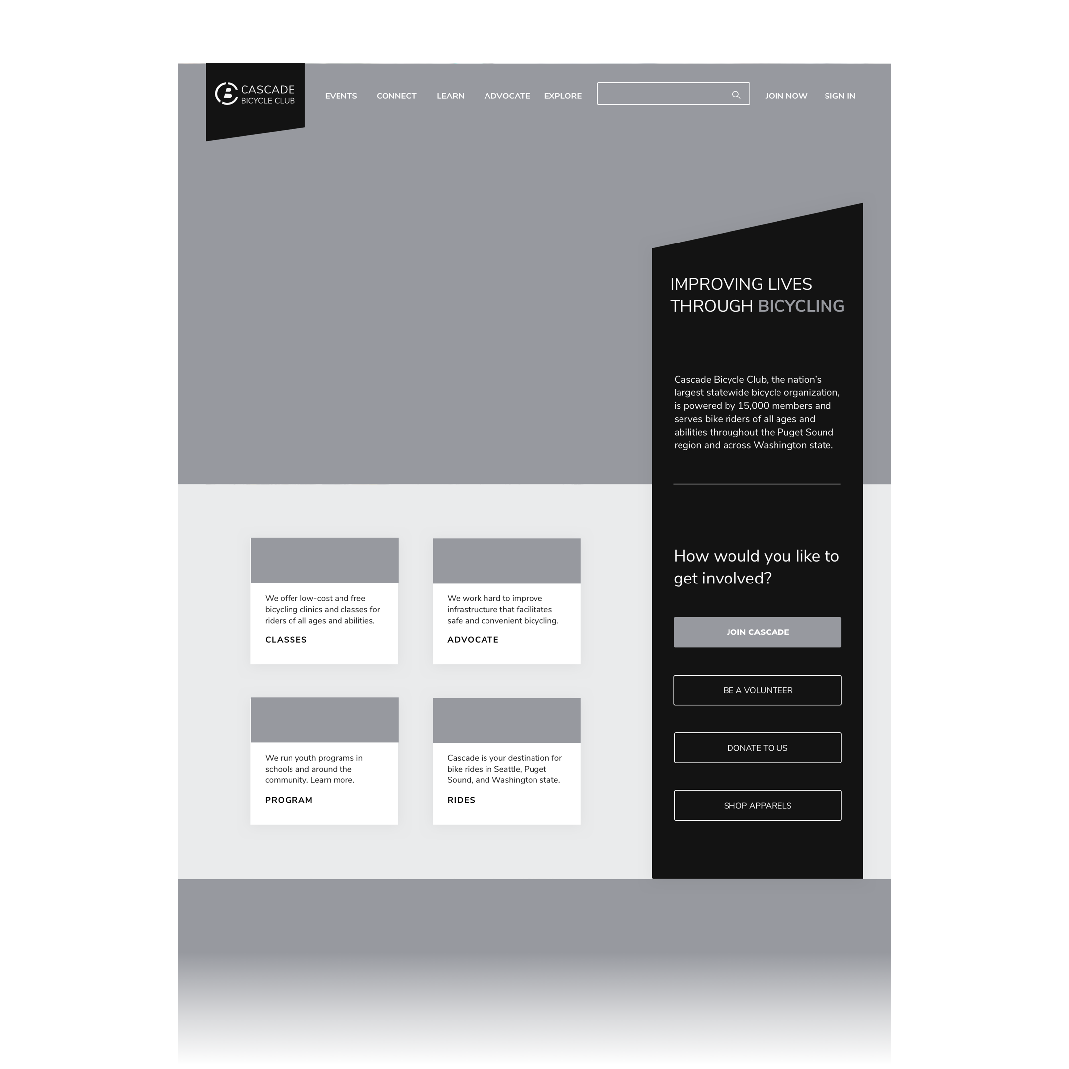
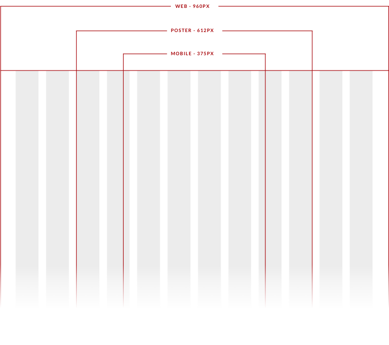
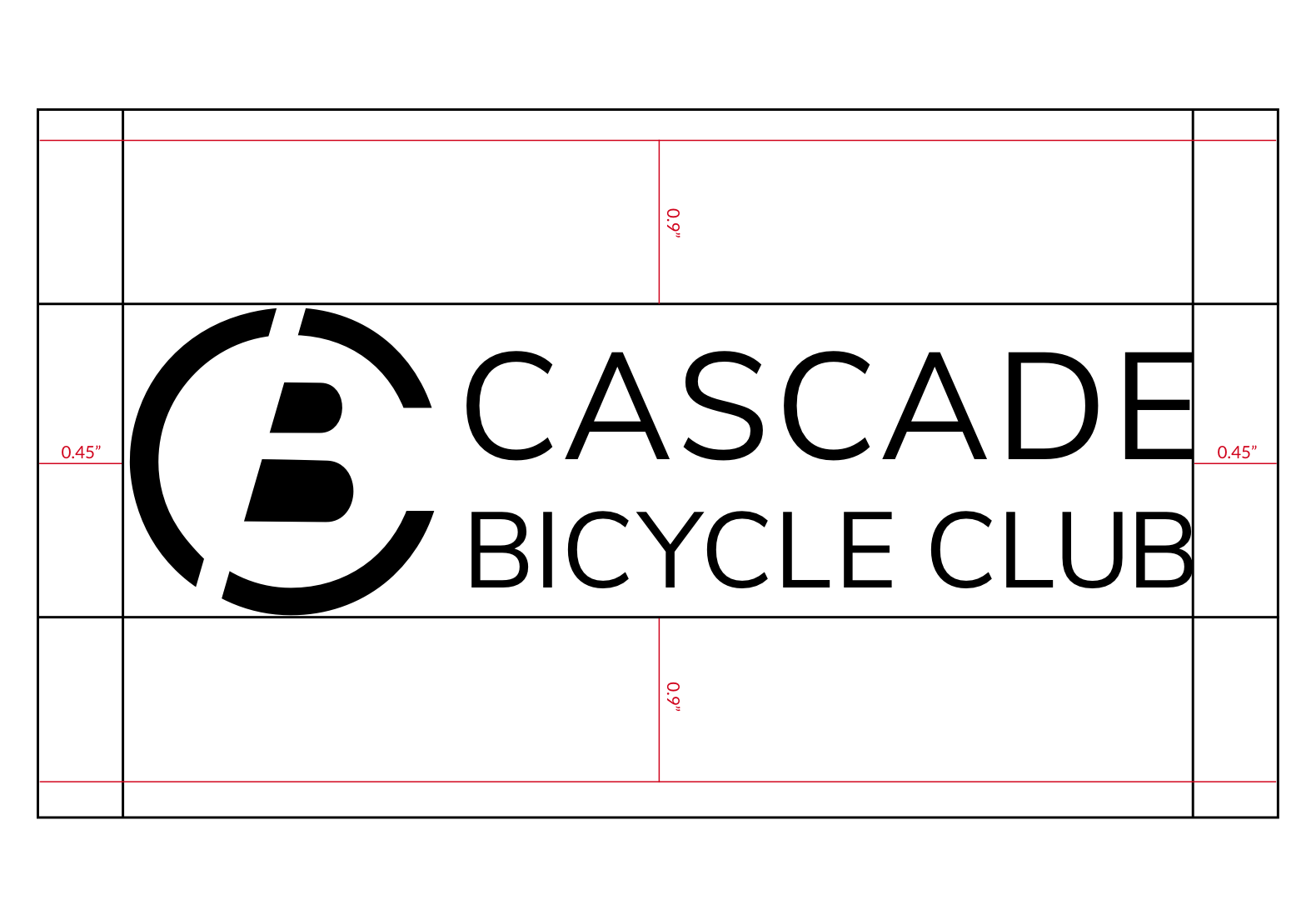
I used a standard 960 grid with 12 columns to layout the content for the web version. The column width is 60px and the gutter is 20px.
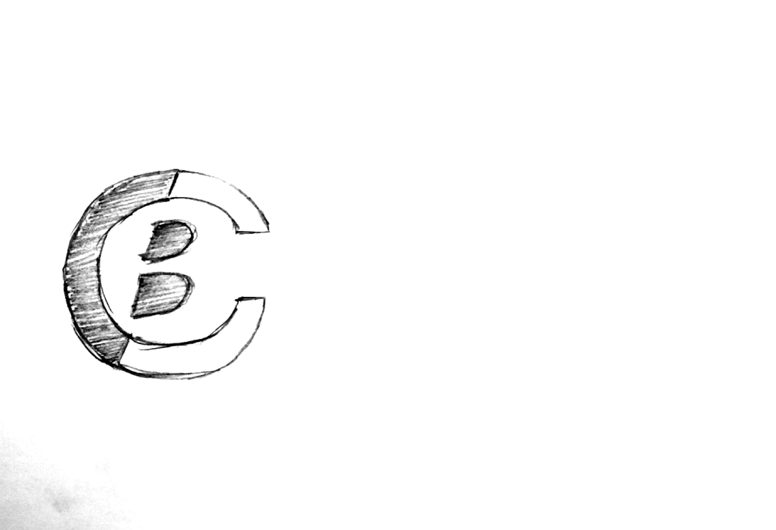
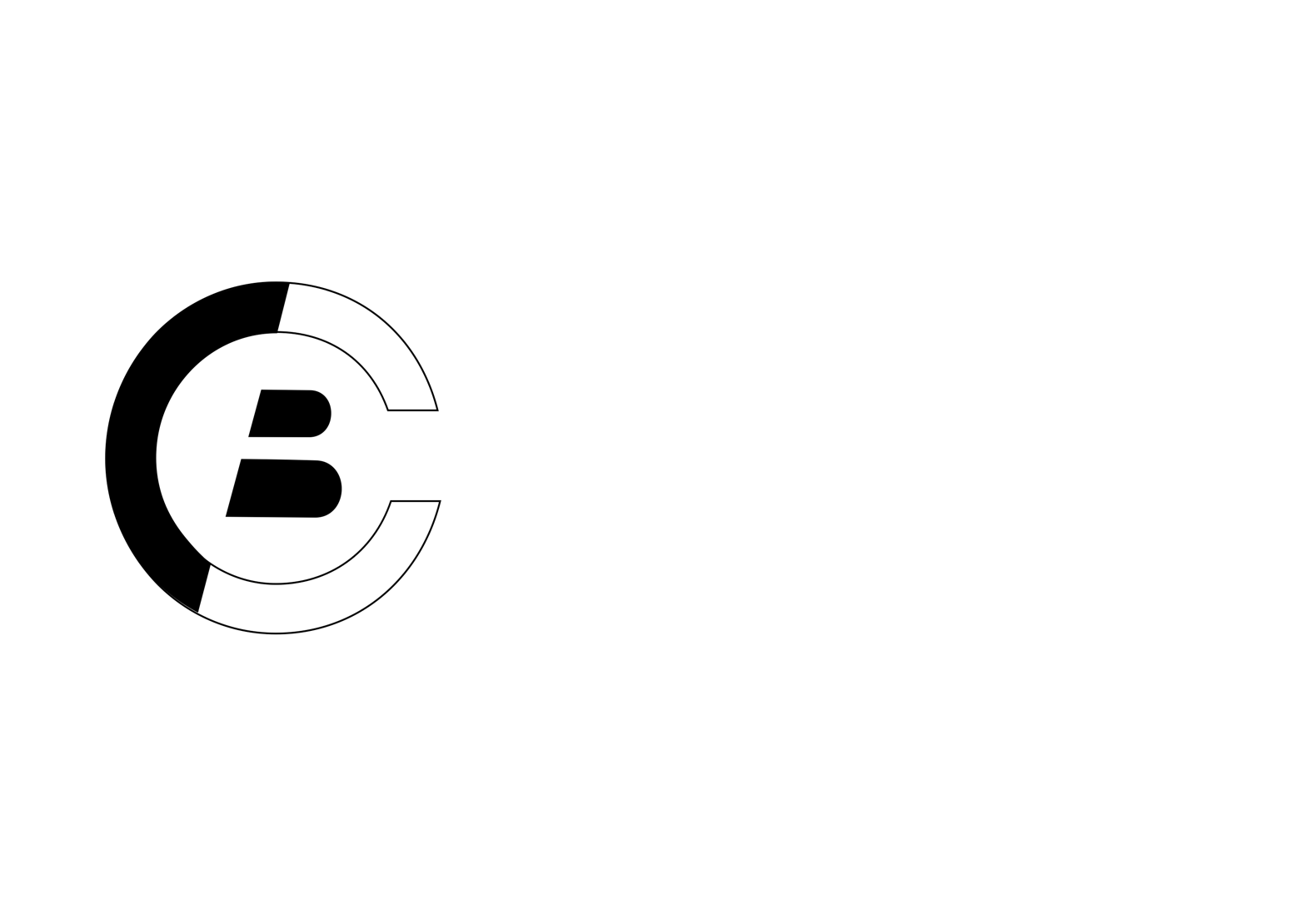
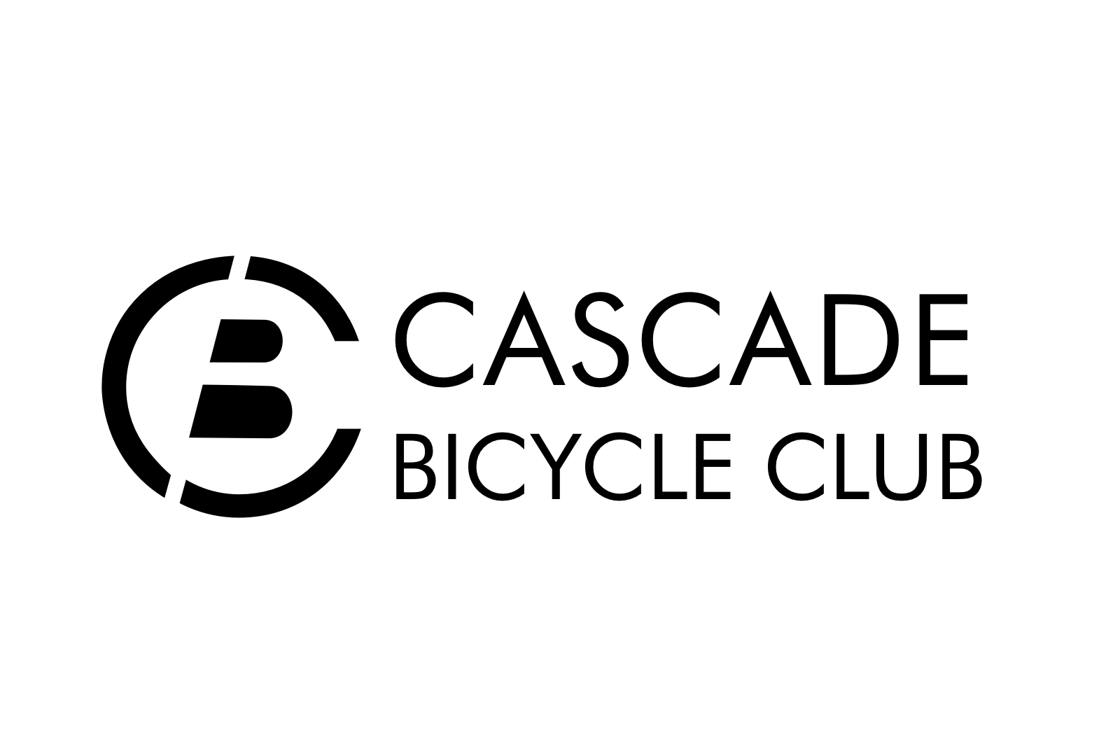
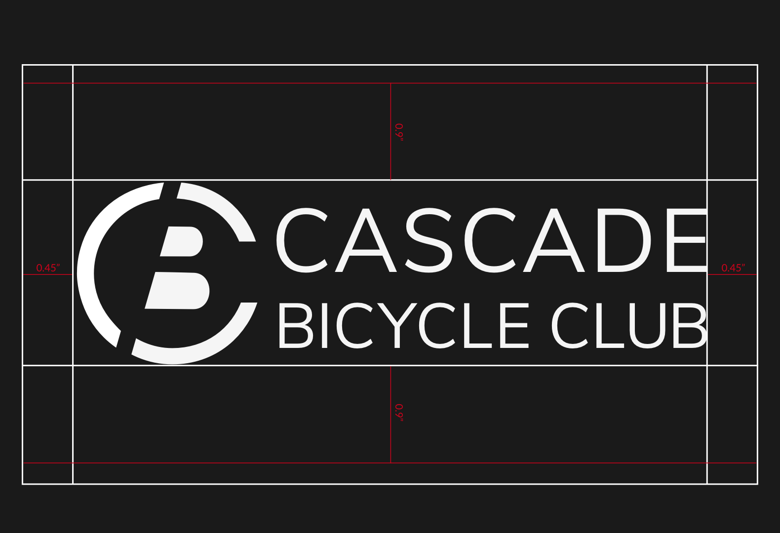
After a lot of sketching and narrowing down to three options including two emblems and a letterform, I decided to go with the letterform logo. I did an iconic logo design by including a wordmark with it.
I tried to play with the letter C by closing its loop further than usual and using the negative space of the letter B inside the C to make it an abstract representation of a wheel but at the same time reading as CBC (Cascade Bicycle Club). I broke down the C and B with a slanting line to add activity. The use of red color supplemented energy to the logo design.
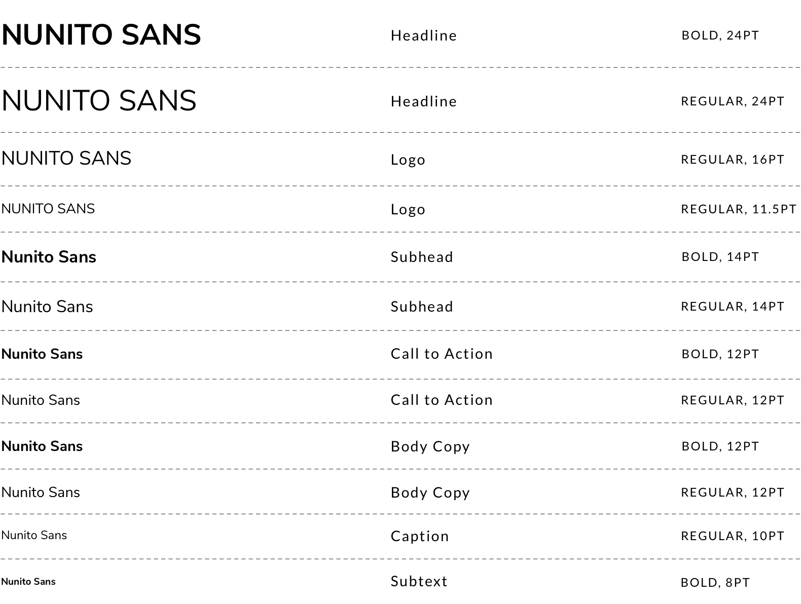
Nunito sans makes for a readable font while being bold and modern. The well-balanced sans-serif typeface works very well at a variety of sizes giving a sharp and crisp feel when used in uppercase and soft and rounded feel which is ideal for reading, in lowercase text.

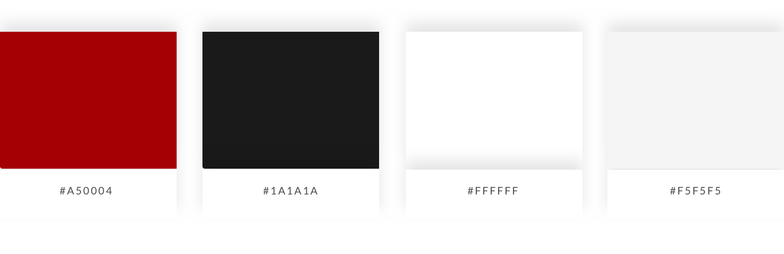
I went with a palette compromising of two shades of grey, a white and an accent red. The intention of the high contrast in the greys (cod grey and white sand) was to increase accessibility and simplicity while keeping it bold. The dark candy apple red adds activity and energy which grabs attention and drives action.
Cod Grey and Dark Candy Apple Red
Paper White and White Sand
I created a brand book to prescribe the use of the grid, logo, color, typography and imagery and show applied examples of different media.
Visual Design is hard. Especially when you’re required to work within constraints, are not allowed to use color/font/imagery and have to develop different parts of the system in isolation. This particular project required me to iterate and I had to keep going back to the initial stages to make things more appropriate and in sync with my with vision of the design language appropriate for Cascade.
With this project I also pushed my limits by coming up with more than one distinctly different options at each stage. This was definitely harder than I had anticipated but it made me realize the power of moodboards. I had never given them enough importance as elements of design. But every time I had to look for a distinct direction to work in, I always turned back to my initial moodboard to find new ideas and it surprises me now, how much variety a collage of images and words could help generate.
That's all folks! Thank you for reading.
PM