Virtual Auto Expo is an interactive data visualization tool that unlike other automobile buying tools on the market allows automobile buyers and business users to view historical automobile trends and make automobile buying decisions based on the trade-offs between price, emission ratings, MPG and horsepower through 2 separate dashboards focused on automobile brands and models.
Designer and Engineer
I was involved at each stage of the process, however, I took up the responsibility of designing the two dashboards with inputs from my fellow designer Saurabh. I also moderated the usability tests but these were not structured studies. I designed the high fidelity version and engineered the buyer dashboard which I coded in D3.js/HTML/CSS3.
Bhuvan M. Shashidhara, Diana Tan, Prateek Mehra, Saurabh Phadnis, and Yash R. Parikh
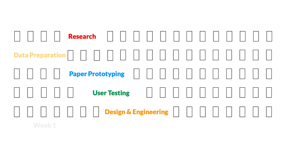
4 Weeks (2018)
Buyers and businesses had different needs from the visualization. The buyers needed to compare specific automobile choices on performance, emissions et cetera while businesses were more interested in the overall brand image and trends over the years.
We looked at existing car buying websites like truecar and cars.com. We found that these websites lacked emissions data and historical data and only allowed for comparison over price and performance through the use of tables. None of these websites used data visualization to make the task of comparing cars easier. They also lacked comparisons between brands and models over time.
We also focused on the EPA website, SmartWay, that allows users to find vehicles based on type and emission ratings. However, the EPA mainly focused on vehicles that meet the SmartWay guidelines which are 20% of the lowest emitting vehicles per year. This meant that vehicles that did not meet the SmartWay guidelines were excluded from the website and the user would not be able to compare vehicles on other parameters. These loopholes in existing systems helped us streamline requirements from our own visualization.
We sought to create a visualization that allowed users to see all vehicles and compare performance over time on a wider range of factors regardless of availability and compare them on multiple factors.
None of the existing dashboards that we surveyed provided complete information including performance, price and emission ratings of different vehicles, nor did they provide a visual way to compare different automobile models or brand trends to easily compare various options. Usually a table lookup was required to make any deductions about different vehicles.
- Lack of a visual way to compare vehicles
- Either information on price and performance or information about emission ratings; None with both
- No dashboard for brands to compare their brand value against competitors
In our initial design, we started with brainstorming many different ideas on how we wanted to approach different types of users including basic car buyers, business users, and environmental users.
We heavily relied on the taxonomy of interactive dynamics for visual analysis by Jeffrey Heer and Ben Shneiderman to narrow down the types of visualizations which could be appropriate for the overview, the types of possible filter and zoom details which would help in exploring the data for each type of user.
We did a quick exercise of the Five Design Sheets Method for our initial brainstorming layouts, diverging while sketching ideas and arrived at several dashboards.
From here we arrived at our paper prototype that consolidated ideas from our initial layouts to create a hive plot with price, horsepower, emissions and MPG on each axis for the buyer dashboard with scrubber filters on each of the axis.
We tested our paper prototype with 6 users including 2 females, 4 males who were graduate students at UW. We briefed each user about our data visualization and asked them to evaluate the paper prototype for ease of use, the ability to understand the data presented and the overall look and feel.
While some users felt that the fidelity of the prototype made the lines confusing, our key takeaway from the study was that the visualization was confusing and overwhelming. Some users also found the different colored axis of each parameter and the angle of the axis confusing. Understanding the scrubbers and the curved lines on the hive plot were also challenging to some users.
- Hive plots have a learning curve
- The amount of information displayed upfront was overwhelming
- Users preferred simplicity - Filters outside main visualization
- Decided to move from a hive plot to spider chart for comparison of different features
- Separated the scrubbers and added parallel coordinates to assist filtering on primary parameters
- Added dropdown filters for secondary parameters to help narrow down choices
- Populated spider-chart only when the number of vehicles reached 20 or less
- Added an interactive legend on the side instead of a tooltip to keep the visualization as clean as possible
Some users stated that the initial use of the model dashboard was slightly confusing because the spider-chart doesn’t populate data immediately. Based on this feedback, we included a brief description regarding the task to filter vehicles to compare models on the spider-chart. Selecting more than 20 cars starts to obscure the substance of the visualization. When the visualization becomes unreadable with too many vehicles, it also distorts the data.
The price coordinate in the parallel-coordinates chart-filter was highly skewed because of a few high priced cars (like Lamborghini), but most of the cars were crowded in the lower price range. This made it difficult for the users to filter the cars in the lower price range. The linear axis caused this problem; a logarithmic scale on the axis would have helped to show the cars in the lower price more clearly based on the input of a few users.
- Use accessible colors to make visualization more inclusive
- Implement the logarithmic scale on price filter in the parallel coordinates
- Introduce user onboarding on the buyer dashboard
That's all folks! Thank you for reading.
PM